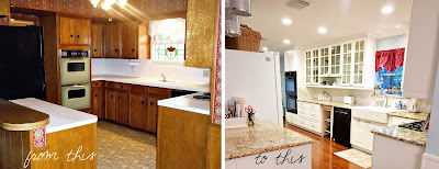
THE KITCHEN. It was an amazing, stressful, dreamy, tough, really fun,
totally worth it kind of project.
Warning: epically long post.
So, a little background on the house we bought is that we purchased from the original owners, who built the house back in 1968. One of the first on the street. They took very good care of the house, lucky for us! But no doubt, the interior was... dated. And the floorplan was like most built in that era: large formal living, small formal dining, small kitchen and large den in back.
Here is the most complete "before" photo I could get:
This is standing farther out, where you can see
the counter overlooking the den a little better:
Here's a close up of the fridge & pantry,
looking into the original dining room:
And standing in center of kitchen,
looking toward dining room:
And this is standing in the dining room,
looking directly opposite of the last photo,
(the wall behind the ovens):
From the second I walked into that house, I knew that wall needed to come down. The kitchen would double in size! So basically the second we closed on the house, this happened:
Going, going, gone!
Wow, you can see across the kitchen-- gone are the pea green ovens!
Here's a view from the opposite side:
Next thing we did was open up that tiny little pantry
next to the fridge and frame a nice big one:
hooray!
Then it was cabinet demo time. We tore out all of the old top and bottom
wood cabinets. And as usual, by "we " I mean my darling husband, he-man.
Bye old sink! Bye gross counters! Bye dated backsplash!
You also might notice that we had the "fur downs" above the top
cabinets demo'd as well. It opened up the room SO much.
Quick sidenote-- we found even more dated, I think original
construction wallpaper underneath the already old wallpaper.
It was pretty groovy...
With everything demo'd out, it was finally time to build and install the new cabinets.
No, we did not do this ourselves, and yes that was the best decision EVER.
Things moved pretty quickly then. Appliances, gorgeous granite counters,
glass cabinets unveiled. Can lights installed!
One of my favorite days was when this little beauty got put in.
A shiny birthday present from my daddy. Perfect.
Last but certainly not least, the backsplash went in.
♥ I was in Loooove. Still am! ♥
♥ I was in Loooove. Still am! ♥
So finally (thanks for sticking thru this post y'all)
here is the finished kitchen
from the vantage point of the very first "before" photo.
We leveled that large counter to the den down and cut the length a bit too.
Now the kitchen extends all the way down the length of the house.
The new double oven is basically in the former dining room.
Now the kitchen extends all the way down the length of the house.
The new double oven is basically in the former dining room.
We made play areas for the girls! And a nice desk area too.
I'm so happy with how the pantry looks now.
I really wanted those glass paned double doors!
Close-up of play areas and desk
And now facing the other way, looking toward sink & stove,
I've indicated where the wall we took down used to be
Here is standing back a bit more, from the same
vantage point as I took "before" photo #5
I'd say it's a little bit different!
And my new, wider pantry is amazing.
There have been a lot of comments and debate about being able to see into it.
No, I don't keep it super organized.
I'm not even that great at keeping the glass clean. I still love it.
I love the brightness and colors and modern feel. But nobody loves it more
than Maddie Brynn. She loves to play pretend and peek-a-boo. I
think it's great I can actually see what she's doing in there!
Let's get back to the cabinets though. The glorious, glorious cabinets.
Bright white, shiny handled lovelies.
Here are a few fun things I got with my kitchen:
That's not even mentioning all of the glass paneled doors we did.
I've been dreaming of those for a long time.
I just really enjoy getting to see inside my cabinets. Like, a lot.
Did I mention all drawers and cabs have the soft-close feature? Heart.
Here's a closer look of the sink and stove area:
In conclusion,
And that, my friends, brings us to the close of our kitchen renovation!
Next up is the dining room (former formal living room).
In the future I am also going to do a post on exactly how I designed
the kitchen, and how I got everything done under a tight budget.
Stay tuned :)


love your kitchen
ReplyDeleteFabulous reno, Cassie!
ReplyDeleteI had to laugh at the wallpaper. The link below is a pic of me in the kitchen when I was about 17...note the wallpaper! I remember my mom being so excited about it, it was from Ethan Allen, quite expensive and designer chic. We even had the exact same paper in blue in the living room!
Chris
https://scontent-b-dfw.xx.fbcdn.net/hphotos-prn2/1469936_10202144253441613_99136621_n.jpg